Call us
+ ( 420 ) 603 40 77 11

Science Dynamics
Hits: 6189
Spreadsheet Shortcomings
There are certainly many applications where a spreadsheet is an invaluable tool. It can be used successfully in situations where all of the following assumptions apply:
- The problem is static (time does not play any role).
- There is no delay between cause and effect.
- Relationships between variables are linear.
- Relationships between elements do not form feedback loops.
These assumptions are met only in a very limited range of problems. However, the spreadsheet is also used in situations where these assumptions do not hold, and therefore remain ignored.
One of many examples is the huge financial loss in London caused by using a spreadsheet as a risk modelling tool in a system that was dynamic, delayed, non-linear and contained feedback. The meaning of these terms is explained in our articles, the literature and in the Science Dynamics Review.
Because seeing once is better than hearing a hundred times, we have prepared several simulators that compare the results of tasks calculated using a spreadsheet and system-dynamic simulation in Vensim. Explore the sample assignment, look at the corresponding figure (we call it a flow diagram in systems science) that explains the logic of the modeled problem very clearly, and test for yourself how valid the results are provided by the compared tools.
Because seeing once is better than hearing a hundred times, we have prepared several simulators that compare the results of tasks calculated using a spreadsheet and system-dynamic simulation in Vensim. Explore the sample assignment, look at the corresponding figure (we call it a flow diagram in systems science) that explains the logic of the modeled problem very clearly, and test for yourself how valid the results are provided by the compared tools.
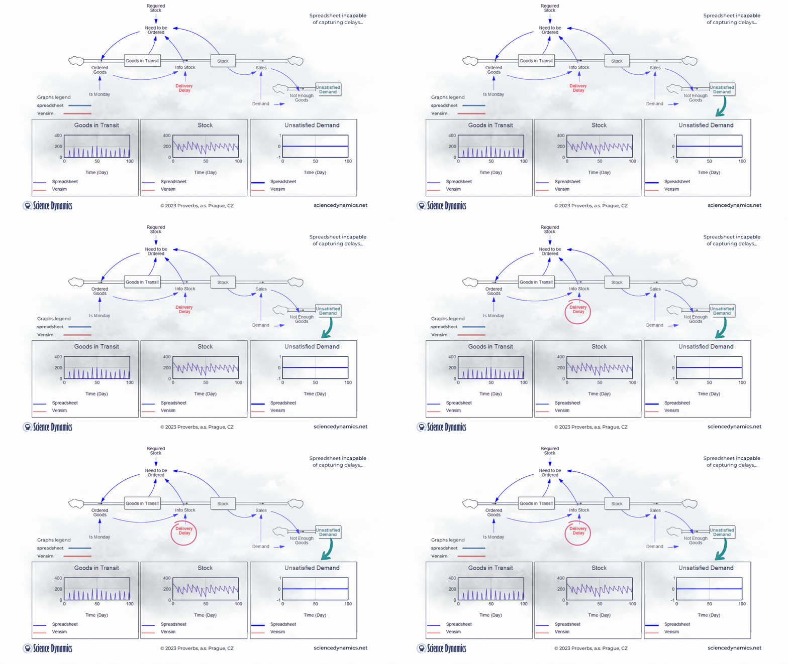
Figure 1 Comparison of spreadsheet and dynamic simulation results. Modelling delays.
Absence of Delays
The first shortcoming of spreadsheets is the impossibility of setting a delay between cause and effect. The assignment of the first problem is trivial. Consider a small business that buys wholesale goods and sells them to end customers. Demand is not constant but has a normal probability distribution. In this, the spreadsheet and Vensim do not differ. The difference is found in the middle part of the model in Vensim, which expresses the delay between order and delivery. If the goods are stocked immediately, there is no problem - the graph on the right, which expresses the unsatisfied demand, is zero for the whole period. This is despite the fact that we only order on the first day of the week - note the variable called "It is Monday". However, try setting the value of the red "Delivery Delay" variable to a higher value than the original single day. You'll find that the patterns in all the graphs start to differ dramatically from the static spreadsheet calculation. The dynamic simulation shows that under the given conditions, a serious shortage problem will arise and the volume of unfulfilled orders will grow.The blue pattern that marks the spreadsheet calculation does not change. This is because the delay in the spreadsheet cannot be modeled and remains
therefore ignored. Dynamic red patterns look much worse from a business perspective than static blue ones, but note that the blue ones have little to do with reality. Try for yourself how easy it is to use Vensim to express such a basic phenomenon as delay. Simply run the simulation, set different delays with the slider, and see what impact the delivery time will have on inventory and the volume of unsatisfied orders. You can run the simulation by clicking here.
Ignoring Feedback
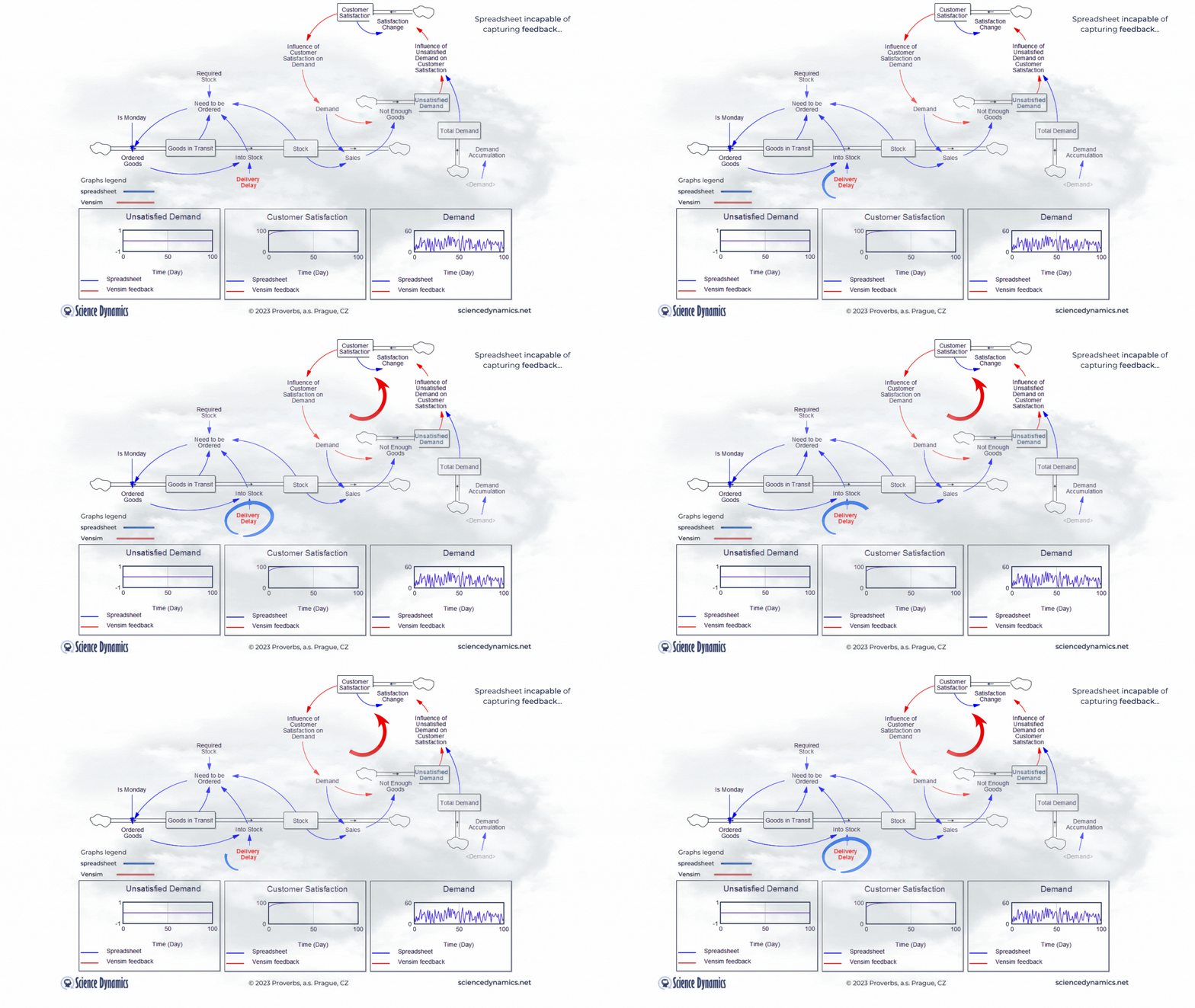
The second spreadsheet shortcoming is the impossibility of creating feedback dependencies. You may think this is not important, but let's continue our story. The systems view is also called holistic because it includes all the influences that substantially affect the behavior being modeled and thus the answer being sought to the question asked. If you do not have a monopoly on the goods in question, it is fair to ask what an increasing volume of unfilled orders will do to the behavior of existing and future customers. Customers are not enthusiastic about late or non-delivered goods, so it is to be expected that a growing backlog of orders will have a negative impact on customer satisfaction. Declining customer satisfaction will often have an impact on demand - demand will also start to decline. We have added a new structure to the model in Figure 2 to express this basic business phenomenon. By increasing the delay between order and delivery using the same slider as in the previous case, we find that the demand for our product, initially matching the blue waveform calculated by the spreadsheet, begins to decline. This has created a feedback loop in the dynamic model. Why isn't the blue spreadsheet waveform also falling? A feedback
Figure 2 Comparison of spreadsheet and dynamic simulation results. Modelling feedback.
loop cannot be created in a spreadsheet and is therefore omitted. If you try to create one, the spreadsheet will report an error - something like " attempt to create a circular dependency". Now try working with Vensim yourself. You can run the simulation including feedback by clicking here..
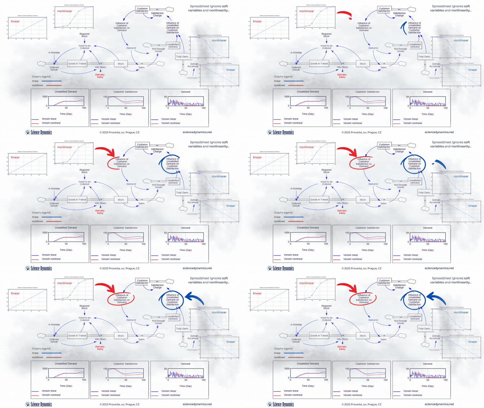
Figure 3 Comparison of spreadsheet and dynamic simulation results. Modelling nonlinear variable relationship.
Neglected soft-variables and nonlinearity
Another shortcoming of the static approach and thus of spreadsheets is the neglect of soft-variables. In the dynamic model we already have them, they are very useful in creating feedback loops. For example, a simple customer satisfaction value, which can range from 0 - 100, with zero being absolute dissatisfaction and 100 being customer nirvana, is not so easily linkable to demand. It is obvious that demand in such a case will be influenced by 'something' which will be a function of the satisfaction value. We can call such a 'something', for example, 'the influence of customer satisfaction on demand'. We can create a soft variable in a spreadsheet, but why would we do that if we can't create a feedback loop in which to use such a variable. In systems approach, we express the effect of customer satisfaction by a function, which you can see in Figure 3 in the graph under the name "linear". The trouble is that virtually all relationships in the world are nonlinear. In systems science, we know this well, that's why there's an easy way to create any nonlinear dependency in Vensim. All we need is a computer mouse. The graph on the left in Figure 3,
labeled "nonlinear", shows the degree of influence of customer satisfaction on demand. The graph on the right then shows the degree of influence of the ratio of total demand to unsatisfied demand on customer satisfaction. Note the difference in the graphs between the variables. For the influence of customer satisfaction on demand, the lower the input (customer satisfaction on the X-axis), the smaller the influence (value on the Y-axis from 0 to 1) and vice versa. In systems thinking, we call this " same tendency relationship" and denote it with a plus sign. The effect of the proportion of unsatisfied orders behaves in the opposite way. The smaller the proportion of unsatisfied demand to total demand (Unsatisfied Orders/Total Demand), the higher the target customer satisfaction. We call this the inverse relationship tendency and denote it with a minus sign. Just for the sake of completeness, let us add that the change in customer satisfaction is not instantaneous; its change is driven by another, not yet mentioned negative feedback loop (Change in Satisfaction-Customer Satisfaction-Change in Satisfaction), which is delayed, so that the change will occur within one week. Perhaps needless to say, something like this is impossible in a spreadsheet. Note, that in Figure 3 we are not comparing spreadsheet and Vensim as in examples above, we are comparing linear and nonlinear relationships between variables. It is already clear to everyone that the role of the spreadsheet as a useful tool has ended with the requirement to include delays... Now test for yourself the change in delivery delay and its effect on customer satisfaction and subsequently on demand and observe the difference between the linear and non-linear solutions. The default value of the delivery delay for the linear simulation was set to 35 days, compare a linear and a non-linear run with the same delay set. Remember that even if the nonlinear solution produces a worse result in terms of lower demand, it is much closer to the truth. You can run the simulation from here.
And now all put together
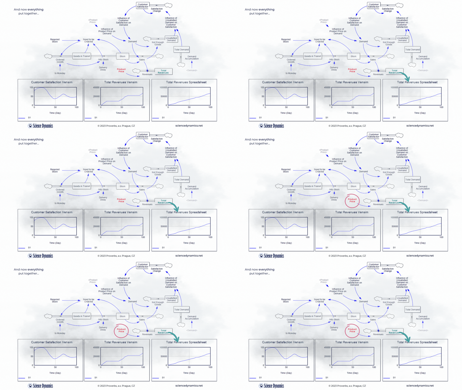
What kind of business model would it be without revenues... Let's agree that revenues can be calculated by multiplying sales by the product price. So in the last part of our story, we'll add a price. The spreadsheet model will only contain what it can capture, so revenues will be the product of demand and product price - after all, you can't do delays, feedback loops or nonlinearity in the spreadsheet model anyway. In contrast, everything that can significantly affect the outcome in the real world is covered in the system model. Therefore, it includes delays in the supply of goods, feedback affecting demand, and nonlinear relationships. In the version shown in Figure 4, one soft-variable has been added. Surely you will agree that customers are usually reluctant to pay any arbitrary price for a product. So let's create a new variable called the influence of product price on demand and join it to the existing influence of customer satisfaction. Customer satisfaction should now be formally called "customer satisfaction with the product delivery", but just remember that. We don't need to delay the influence of price on buying behavior; price usually determines willingness to buy very quickly. Now try to compare the revenues calculation between
Figure 4 Comparison of spreadsheet and dynamic simulation results. Putting all together and adding revenues.
the two technologies. The delay in Vensim is set, as in the previous example, to 35 days, play around with the product price highlighted in red. The revenue calculated by the spreadsheet, logically, increases as the price goes up. You can find out for yourself what happens with the much more realistic model in Vensim. The blue patterns show the parameter values at the original setting of the constants. Please note the different ranges on the Y-axes - the spreadsheet model claims that sales will be more than ten times higher than Vensim. As we already know, Vensim considers important real parameters, while the spreadsheet does not take them into account at all. You might be surprised how customer satisfaction behaves in Vensim. As the price increases, the original blue pattern pattern changes significantly. Email us before the end of March 2023 with your explanation why it does what it does and you will receive a 10% discount on the purchase of any Vensim licenses! You can run the revenue model simulation from here.
If you've read this far and tried a few selected Vensim features yourself, you'll certainly not be going back to spreadsheets when modeling dynamic assignments. Many applications of System Dynamics and Vensim licenses are described on these pages and in our journal Science Dynamics Review. You can easily get your own license in our store, and we will be happy to teach you the entire Vensim in our learning programs.


